Similar tools in category
Explore More
Adaptive Images
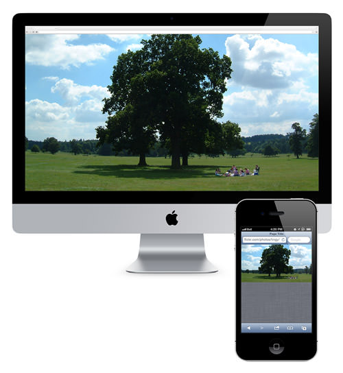
Automatically adapt your existing website images for mobile devices. No mark-up changes needed. For use with CSS3 Responsive Designs.

Choosing A Responsive Image Solution
If you read Smashing Magazine, you’re probably already on board with creating the best possible website experience for your audience. And if you go the responsive design route then you’ll need a strategy to make images flexible, too — a responsive image solution. This article leads you through the basics, and then arms you with the information you’ll need to pick the best responsive image solution for your situation.
Clown Car Technique
Clown Car Responsive Image Technique. Contribute to estelle/clowncar development by creating an account on GitHub.